A simple line animation shouldn't take three tools.
Figma, After Effects, export plugins - just to get something basic working. So most designers don't bother. They either export a GIF, or drop motion completely.
Draw Me Lottie removes the friction between idea and result. No pipeline, no context switching. You see the animation the moment you create it — and it's ready to embed.
It looks simple. It isn't.

Throughout my degree I helped a lot of classmates who got stuck on exactly this: a line that draws itself. It looks like a five-minute job, and it ends up taking After Effects, Trim Paths and an export plugin.
Before building, I looked at what designers already use.
A full animation editor outside Figma, with timelines and keyframes. Exporting Lottie is a paid feature.
Powerful timeline animation for Figma designs. Great for UI motion, but a whole editor to learn for one line drawing itself.
Nothing did just this one job, right inside Figma. In Draw Me Lottie, the moment you click, it's animated.
Watch how Draw Me Lottie transforms static Figma vectors into smooth, production-ready Lottie animations in a matter of seconds.
Hours back. For the simplest animation.
All that work — for a line that draws itself.
The old way
Draw Me Lottie
What testing changed
Before launch, three people tested it: a product manager, a designer and a senior designer. These changes came straight from their feedback.
A first-time tester didn't read the filled chips as checkboxes. An “on” toggle looked exactly like the selected Mode button right next to it.
Full fill for one-of-many choices. A soft fill with a visible checkbox for on/off. Same row, two behaviours you can tell apart.
Before

Mode and Playback look the same when selected.
After

Choices fill; toggles get a soft fill and a real checkbox.
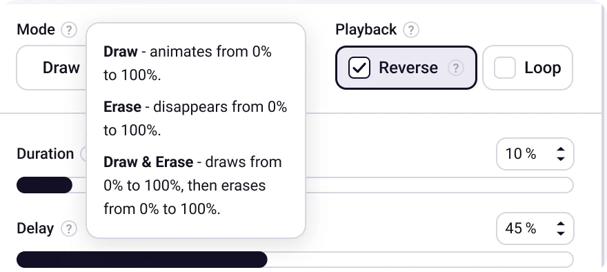
Quiet by default: a light grey ? next to each setting. The explanation only opens on hover.
In user testing I found myself explaining the same settings again and again. If testers need me next to them, the interface isn't doing its job.
A small ? next to every setting. Light enough to ignore once you know the tool, one hover away when you don't.
Users wanted more canvas room. Enlarging the plugin window was the obvious answer - but it broke the focus.
Scroll to zoom, drag to pan, one button to reset. The toolbar can also be collapsed to expose more canvas - without touching the window at all.
Users wanted more canvas room. Enlarging the plugin window was the obvious answer - but it broke the focus.
Scroll to zoom, drag to pan, one button to reset. The toolbar can also be collapsed to expose more canvas - without touching the window at all.
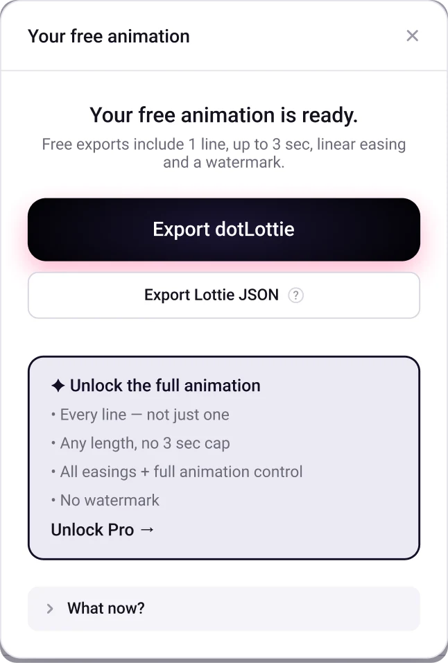
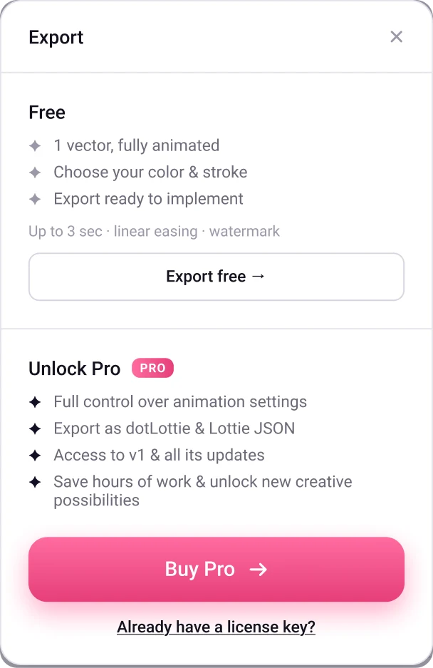
Too generous and nobody upgrades. Too tight and nobody tries it. The free export still had to be a real, usable animation.
One line, up to 3 seconds, linear easing and a watermark, stated plainly before export. Pro reads as “unlock the full animation”, not as a wall.
Hard cuts feel cheap. Pay, and everything snaps to Pro. Export, and a modal just appears. No buildup, no anticipation.
Transitional screens that build anticipation — an export loader, a purchase confirmation. One extra screen that makes the whole thing feel considered.
The export screen builds anticipation - animated by an animation the plugin itself created.
Unlocking Pro - a small dopamine hit. A fresh animation, an unexpected color.
The preview shows the user's own drawing, in their own colour. Any loud UI colour competes with it.
Ink for structure. One pink accent, only on what you drag and on the moments that matter: export and Pro.
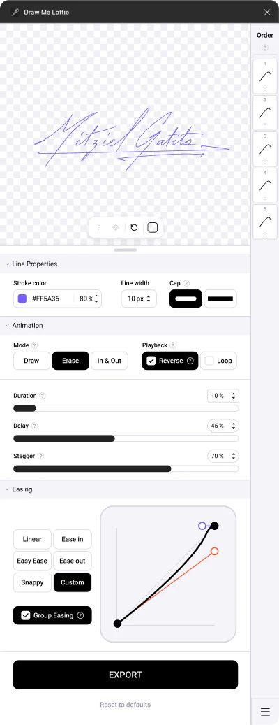
Now
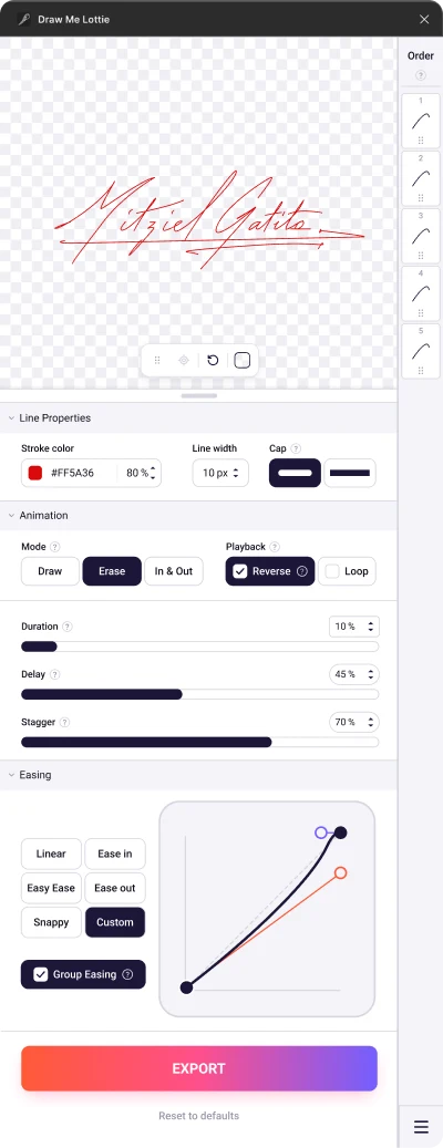
A
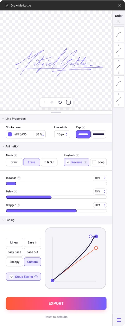
B
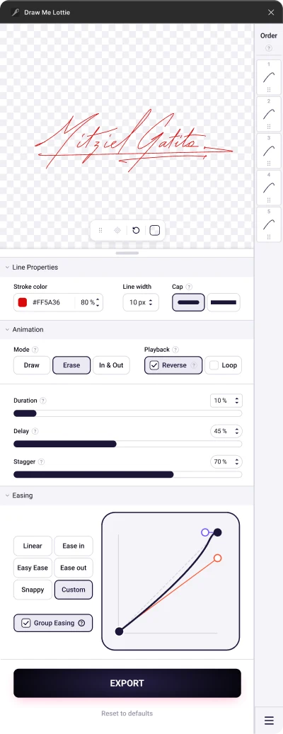
C
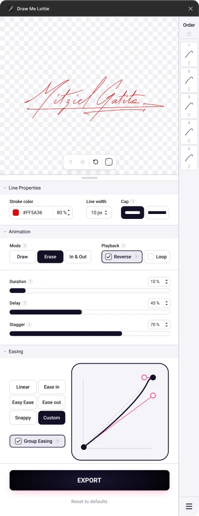
D — chosen
Motion was never the hard part. The tools were.
Draw Me Lottie doesn't add new capabilities — it removes the friction that stopped designers from using the ones they already had.
A few examples of what you can create — straight from Figma, no After Effects.
Tap to play